
NEA Part 1 - Media Language and Representations Analysis


  • The main characters of the magazine is are animals that can be found in the UK. There is an otter, stag beetle, falcon and a mouse.
  • They are represented positively. The magazine give interesting facts about several animals that you can find in the UK and can get kids to be more aware of the animals around us so they won't be afraid of them. The media product gives fun facts and a descriptions of animals that we may have not heard of before.
  • In the media product there is a flag of the UK and the border is made up of  the UK. It can be clear that the magazine is about animals in the UK.
  • The colour scheme of the magazine is blue, red and white which is also the colours of the flag of England.
  •  They took close up shots of the different animals.

  • The colour blue can mean melancholy, sad or depressed. The colour red can mean passion love, violence, danger, anger or adventure. The colour white can mean innocence, purity or wholeness. 


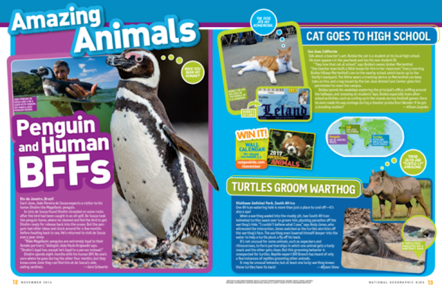
  • The main characters in the magazine are a Penguin, a cat and a turtle with a warthog. 
  • The penguin is represented positively. It shows how a penguin and a man have become friends. You would usually believe that wild animals are dangerous but through this we can see that they are harmless if you treat them with care. In the cat story it talks how a cat ges to high school. The school is very attached to it and love it dearly. 
  •  They took close up and full body shots of the animals.

    •  The colour purple can mean royalty, peace or wisdom. On the other hand blue can mean sad or depressed.
    • In the picture with the penguin and the man, from the body language we can see that they have a close friendship betwwen them. With the cat, it looks very comfortable in the school, showing how the cat is just like a student.


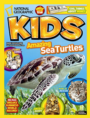
    • The main character in the magazine is a sea turtle. 
    • The turtle is presented positively 
    •  The cover has a bold yellow border and a colourful heading. The colour yellow can mean happiness, joy or optimism. 
    •  In the right hand corner of the magizine it says cool thing about money. This could entice more kids to read the magizne as it might spark an interest. 
    •  Bold, bight colours will interest people.


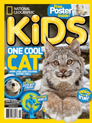
    •  The main character of this magazine is a cat.
    •  The cover has a bold yellow border and a colourful heading. The colour yellow can mean happiness, joy or optimism. 
    • A cat is a comon household pet which means that it will interest a lot of kids as they may like cat


    Comments

    Popular posts from this blog

    NEA Part 8 - Casting

    In this task i am going to be looking at the actors or models i'm going to cast in my magazine. ACTOR: Leonardo DiCaprio Leonardo DiCaprio is a very well known actor that many people know for his movies titanic and Romeo and Juliet. He is also known for voicing his opinion on climate change and how it is effecting our plant while making animals become extinct. DiCaprio has done many talks and speeches on this and donated a lot of money. As well as this he has set up numerous charities that help to protect endangered animals. With a massive media platform he can inform lots of people. On Instagram he has 30.6 million followers and on twitter he has 19 million followers.

    NEA BRIEFS

    K: The requirements for each of the briefs set by OCR. U: How to approach the chosen brief, including writing the statement of intent. BAT: Choose a brief and start planning what to write in the statement of intent. CO: Use media terminology (all areas of the theoretical framework) in your written and verbal communication. I chose Brief 1, where we have to create a front cover and a double page spread article for an informative educational magazine aimed at an audience of 10-13 year old.  While working on this, i want to develop more of my Photoshop skills. I want to learn how to add different parts of pictures into one to form an image altogether that fits my magazine theme. I already know the basic outline of a magazine and how it should be laid out. I know a few photography skills so i can apply that to my magazine when choosing images to add into it. ——————————- Mind Map created by Ellie Chan with GoConqr ———————————

    NEA Part 6 - Product Style Profile

    In this post i will be learning the importance of sketching and planning my magazine. I believe that sketching is important as the sketches will influence my stylistic decisions and reflect my final product piece. DRAFT 1 The above images are a first draft of the magazine cover and double page spread. I asked the opinions of other students who gave back positive and negative feedback. They said that the cover page was too messy and crowded so the reader cannot focus on the main story. Therefore on my next draft i need to have less individual stories. As well as this, on my double page spread the pictures and text are all over the place. To improve this i must keep my pictures on one side instead of alternating them.    DRAFT 2 In my second draft, overall i got positive feedback but there were some improvements needed. On the cover page, the title should be bigger in order for the audience to read it and catch their attention. As well on my double pa...